Details
Project Name: ehsAI web application
Role: Full Time UX/UI Designer
Role Scope: Founding designer
Company: ehsAI
Company Type: Startup acquired by Intelex/Fortive
Date: 2020–2023
AI Document Analysis Made Fast, Intuitive, & Simple
Details
Project Name: ehsAI web application
Role: Full Time UX/UI Designer
Role Scope: Founding designer
Company: ehsAI
Company Type: Startup acquired by Intelex/Fortive
Date: 2020–2023
Skills
User Research, User Flows, Information Architecture, Wireframing, Prototyping, Mockups, Usability Testing, Collaboration
Tools
Figma, XD, Photoshop, Illustrator

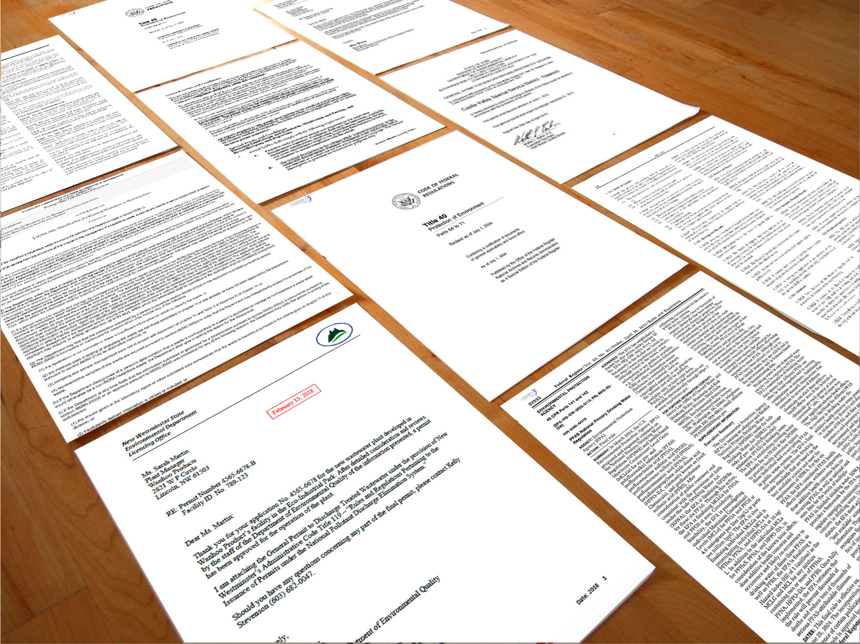
All EHS professionals deconstruct documents by hand with paper and pencil. Moving to digital would be disruptive as most EHS professionals were afraid of or unfamiliar with AI.
One huge challenge was digitizing compliance documents. EHS legal requirements can come from all levels of government (local, state, federal) in all types of formats. The document formatting can be diverse ranging from digital to typewriter-written to hand-written, including tables, diagrams, and images.
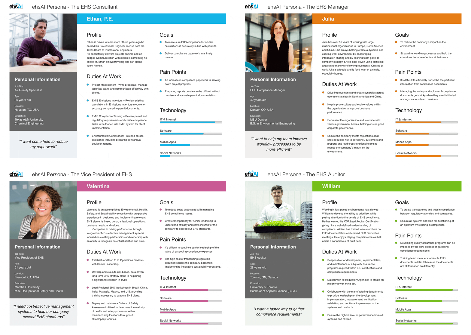
Research indicated four primary EHS personas. Most would want to use the ehsAI app and some would want to purchase the ehsAI app for their EHS team:
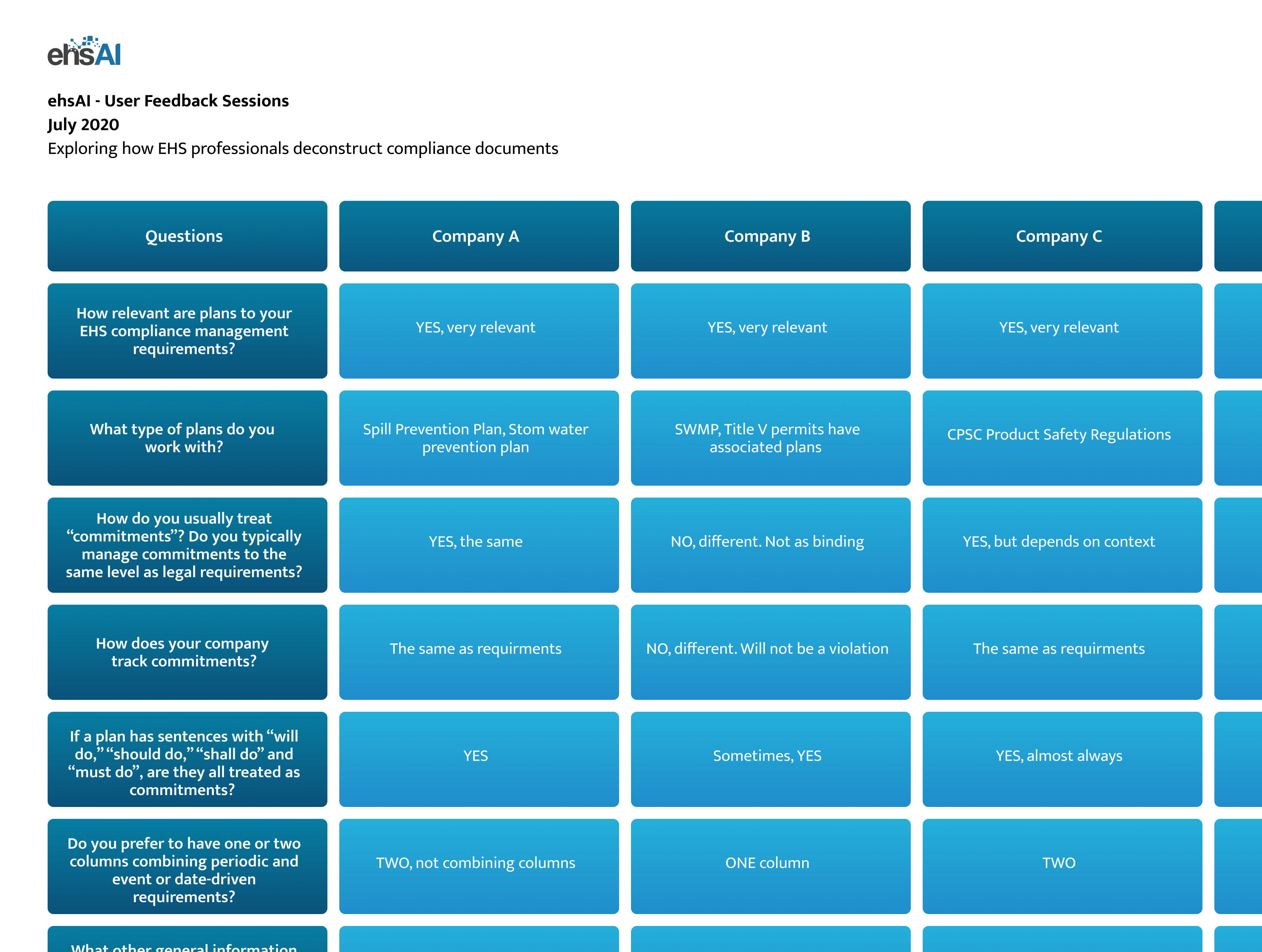
While interviewing customers and potential customers it became clear that deconstructing data could be difficult because:
The AI was broken down into modules that depended on the previous module. This meant having the users work with the AI in steps module to module.
Competitive analysis showed that what we were doing had been attempted before, although all attempts had been abandoned due to the complexity of the problems. Friction points were:
Our team believed we could forge ahead with innovation and creativity using AI to solve many issues.
Red routes are the primary tasks the users want to complete the most often. For the ehsAI app the main red route was the single document upload and analysis flow. EHS professionals preferred to process one document at a time from start to finish. Other tasks like document management were secondary in importance.
Client feedback affirmed the single document upload and analysis flow to be the most important. Later more tasks and features were added to the user flows.
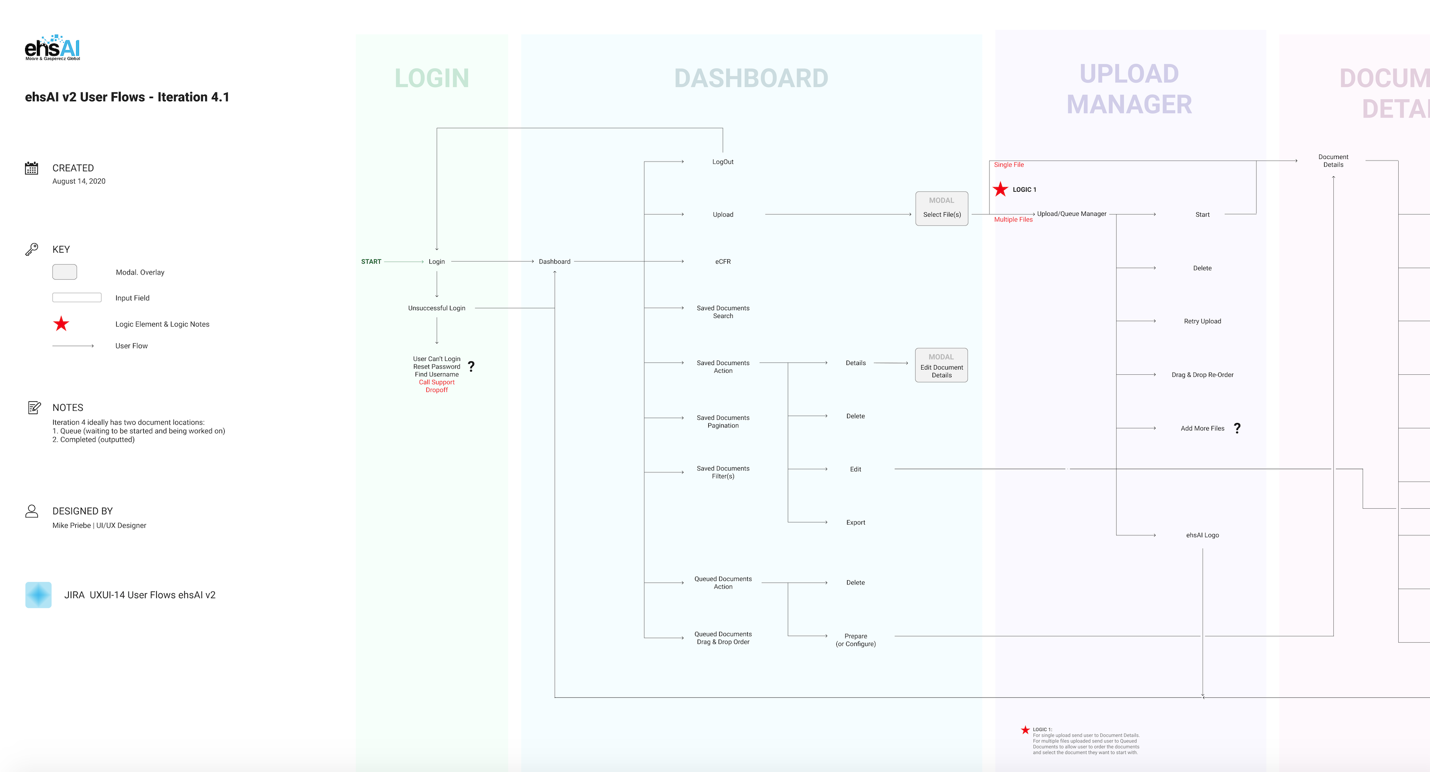
After generating different ideas about grid and screen structures, I settled comprising the user interface of four primary design patterns. This informs the design of each new template and keeps a consistent feel for the user as they navigate throughout the app.

Wireframes were designed to help visualize the information architecture. I prioritized the red routes and organized the workspace of the review steps in way to keep as much of app UI out of the way of the compliance document view.

The document journey went from a customer upload through an OCR (Optical Character Recognition) text extractor into the ehsAI review tool stepper. This meant the ehsAI app was rebuilding the entire document from layout and text to formatting in order for the app, the AI, and the customer to work together analyzing the data for compliance requirements and other important details.
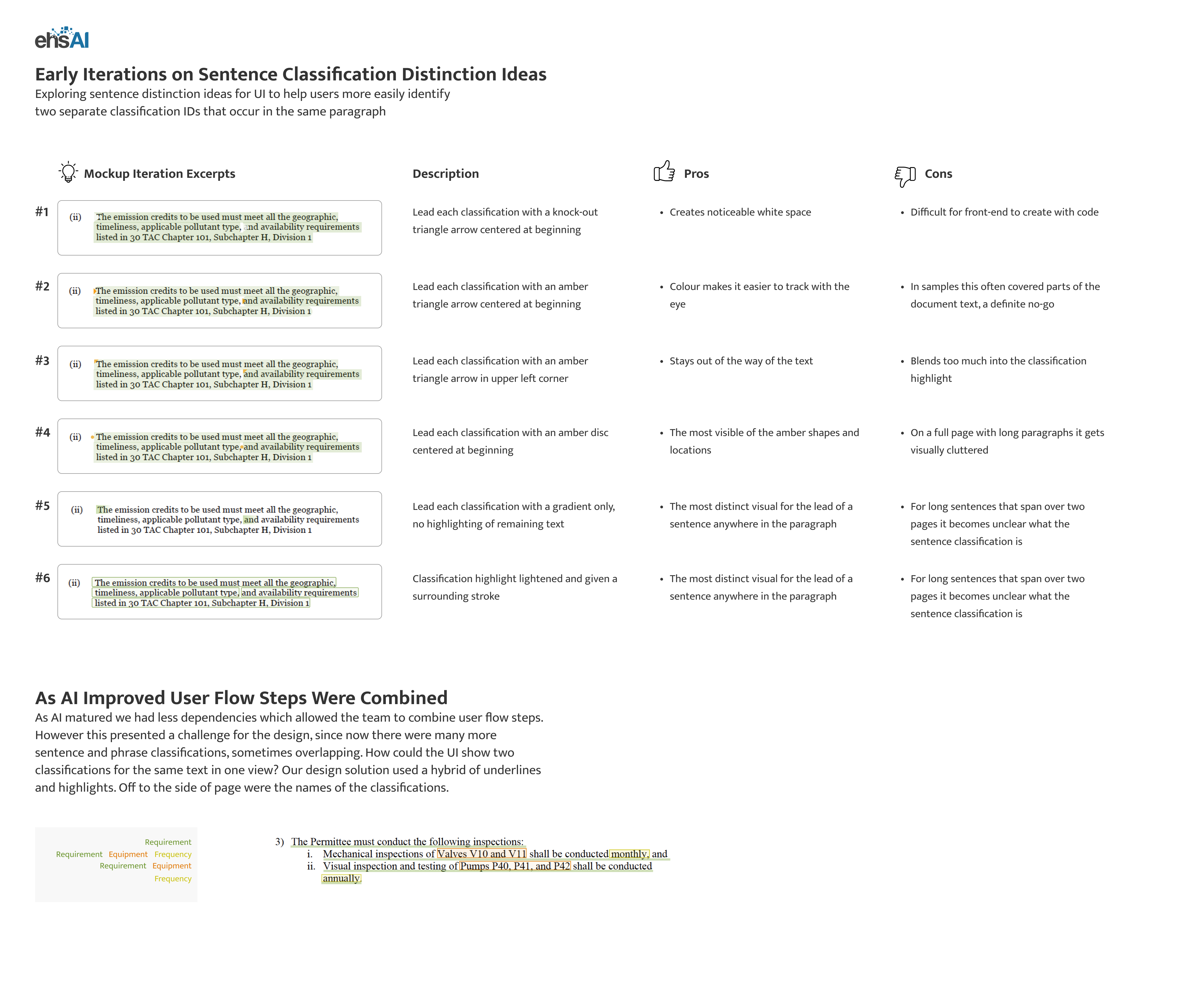
Creating UI for marking the classification of the document sentence text was challenging since we needed a way to show the various text classifications. Labels off the page were used to help with accessibility for the colour blind. Initially we used highlighting to show text classification but as we merged AI steps within the app we settled on underlining for sentence classification and highlighting for word and phrase classification.
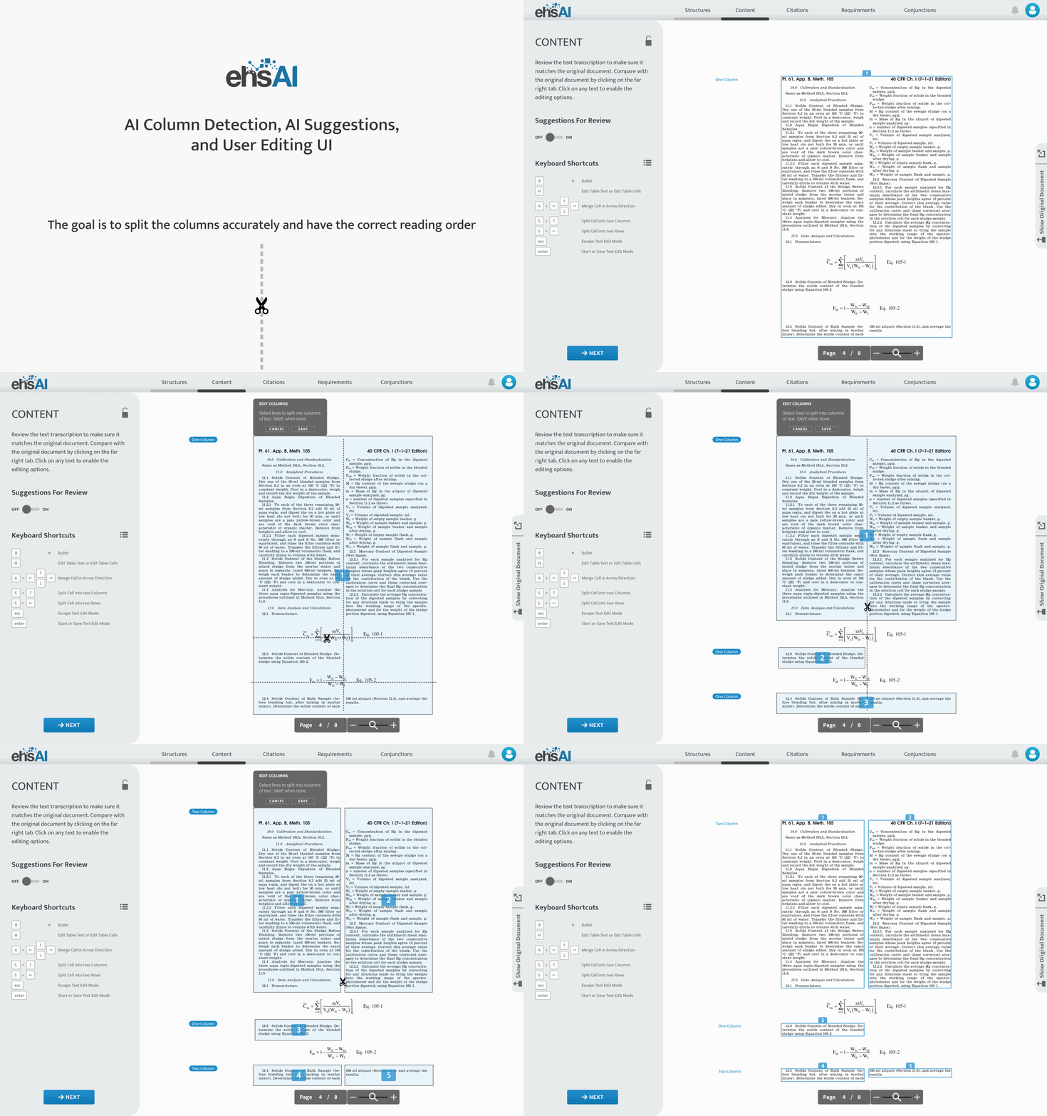
For the most part the AI could accurately detect column text structures. However, for the times when it could not, I needed to come up with UI that helped define columns and accurately portray the reading order of the columns. I created a cutting tool to allow the user to slice up columns both vertically and horizontally and numbering UI to determine the reading order.
Remote user testing was done using online meetings using screen sharing that were recorded. Some key insights revolved around the Hierarchy Step where the users were assessing the AI evaluations of the document's citation hierarchy. Three main pain points were synonymous across the testing observations and user feedback:
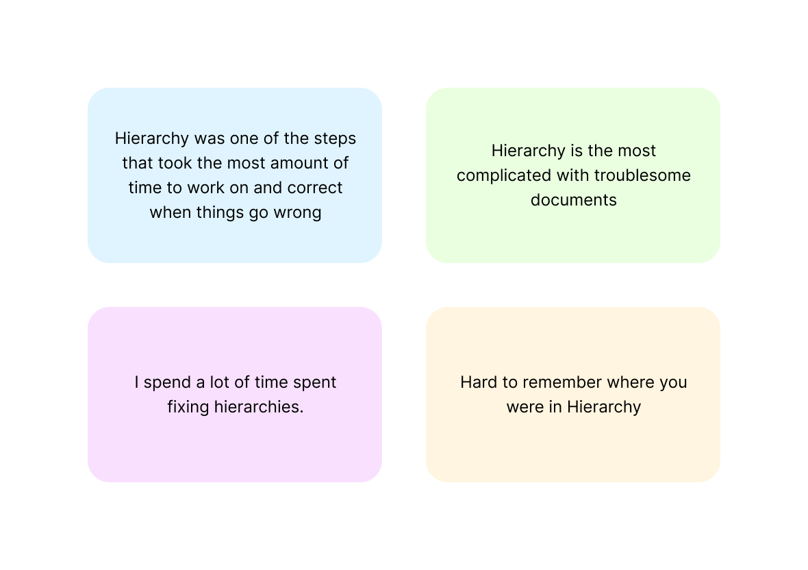
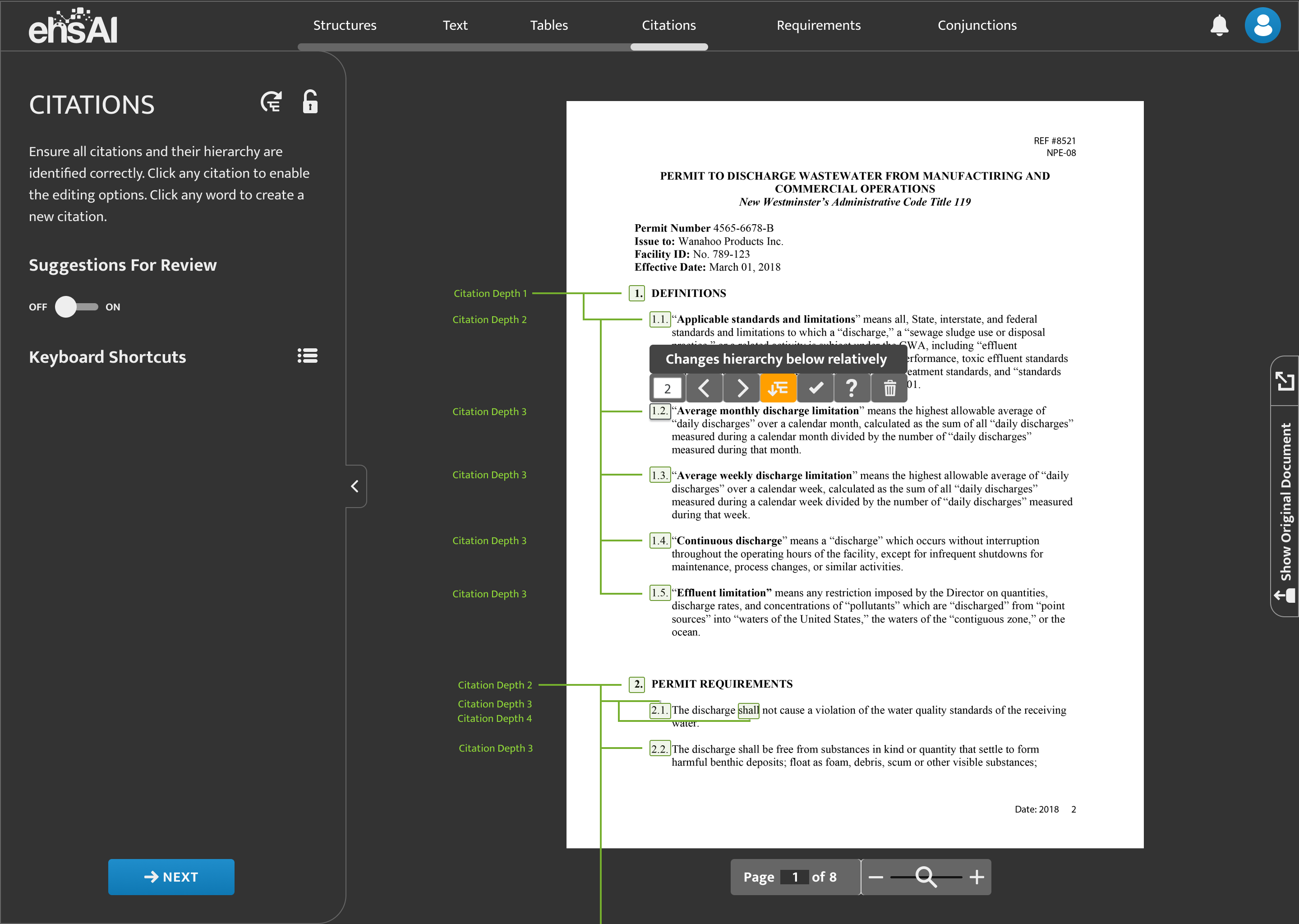
Our team gathered quantitative usability statistics to observe various tasks throughout the ehsAI app. Some key metrics involved the length of time on each of the Review Steps where the user works with the AI to define layout structures, text classifications, citation hierarchy, and citation conjunctions. The statistics corroborated the remote user testing that users were spending the most time on the Hierarchy Step. I worked with the customers and our team to come up with hierarchy lines to help visually show citation depth relationships.
For our longer term users we wanted to hear their thoughts on features they thought would improve their experience. Using Survey Monkey our team was able to gather insightful feedback about feature request. Notable requests like:
These three primary strategies are the goals derived from the original three key questions.
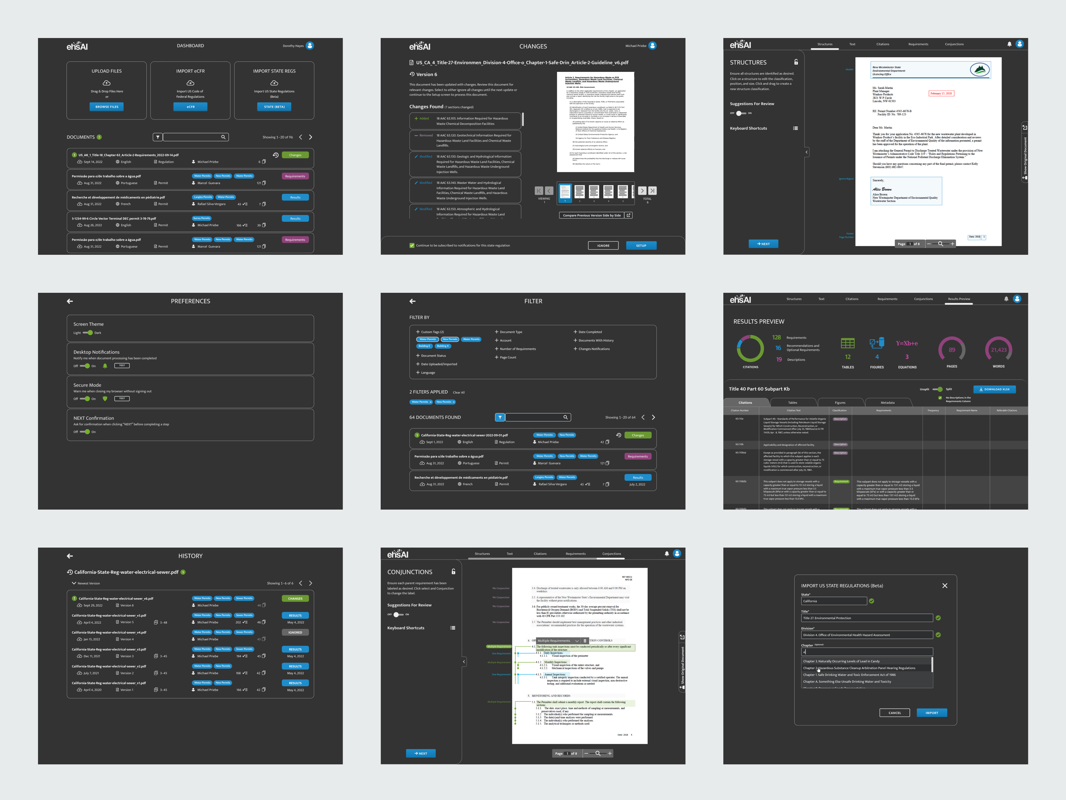
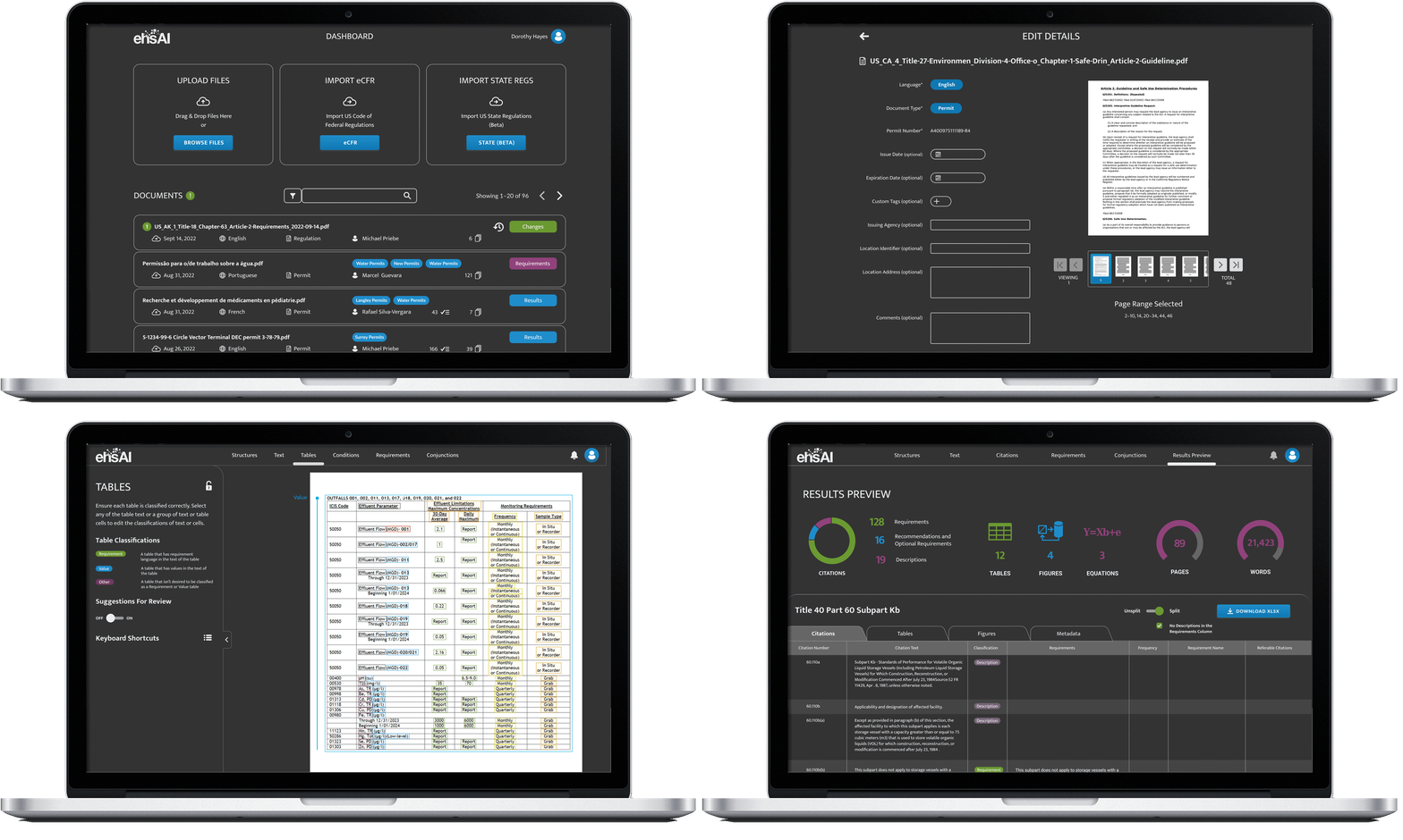
The dashboard features three types of document imports as well as the paginated documents list. Users can also filter their documents list and take action on each document.
The Changes screen features a preview of new versions of previously imported documents giving the user a way to isolate and evaluate changes made to documents, such as the eCFR (Electronic Code of Federal Regulations).
Whenever a previously processed document gets a new version released by law makers a history of versions will be created for it and this will be managed in the History screen. Here the users can clearly see the version history and access any of the document versions for their compliance needs.
The Preferences screen allows users to adjust settings for preferences like Desktop Notifications, this allows the users the choice to receive a notification or not when the AI is processing between review tool steps.
Filtering feature is accessed from the dashboard and allows the user to search their documents list by various filters in any combination. For example, this comes in handy for audits where the user needs to reference documents that have been processed in the past.
The Conjunctions screen is part of the review steps where the user works through the document with the AI to evaluate document text classifications. In this step the user must ensure each parent requirement has been labeled as desired.
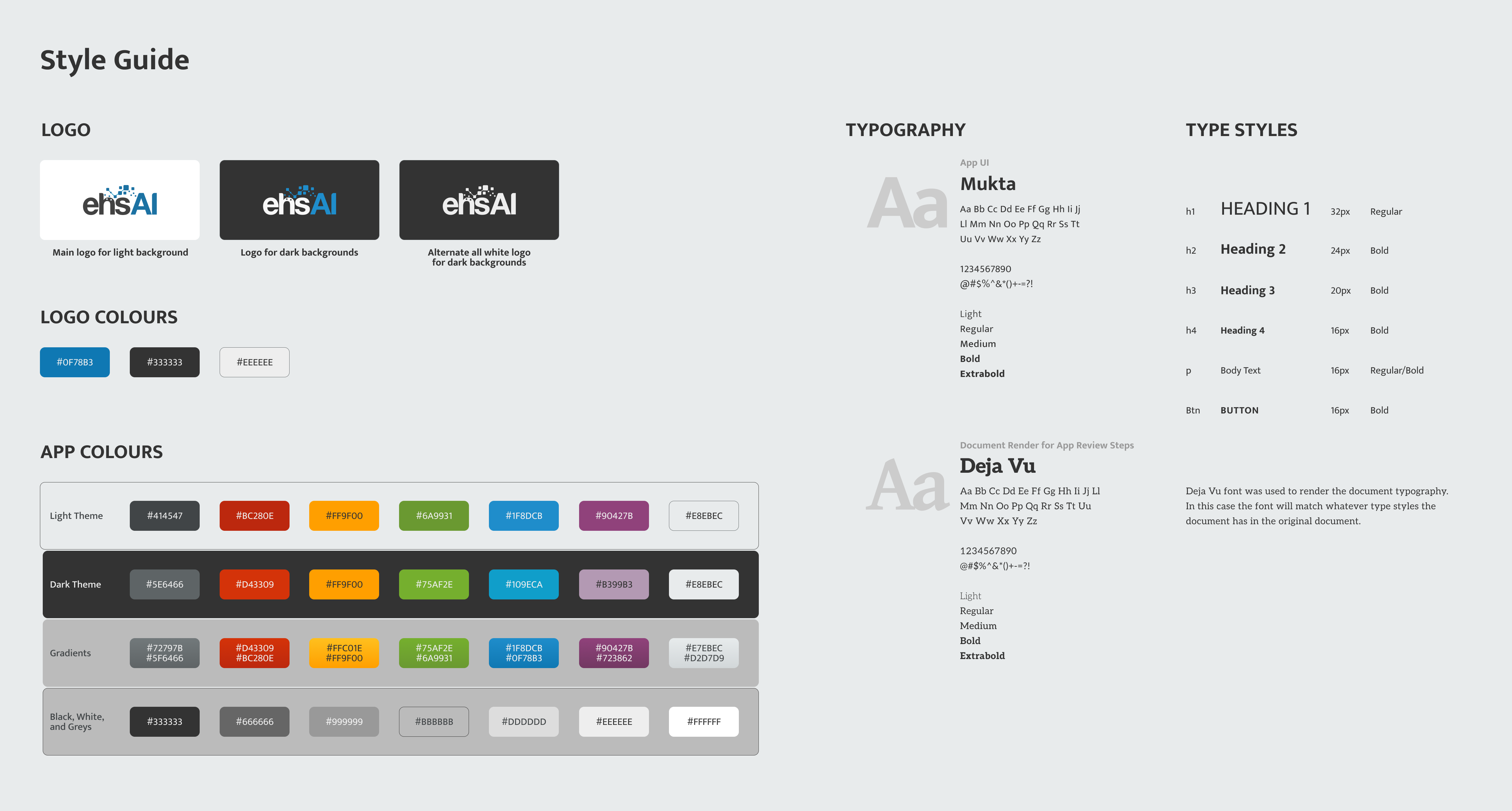
Although the ehsAI logo was established before I joined the team, I expanded the branding by defining and adding the mission statement, values, tone of voice, character, app colours, typography, and custom icon set to keep the experience of the brand cohesive.
We were honoured to have the very talented designer Nikoo Farvardin intern with us while she was finishing her studies at Emily Carr University of Art and Design. She created a library of illustrations that radiated with colour and spunk bringing out the fun part of our brand. We had two points in the user flow of working on a long documents where the processing wait times could sometimes be lengthy. Later I animated her two of Nikoo's illustrations: one for preparing the document for the review steps and a second for processing the document at the end of the review steps.


Our whole team was instrumental in quickly bringing to life a disruptive technology that upends paper and pen with AI/ML by simplifying complex AI interactions and quickly yielding accurate results. We went from a concept to fully functioning B2B SaaS in six months. From there we continued to improve and add features.
Designs that allow Environment, Health & Safety (EHS) professionals to work with AI to deconstruct regulations and permits into useable compliance information saving significant time and money while being more accurate.
Although others had tried and failed, the team at ehsAI successfully built an app that could upload and import compliance documents and give EHS professionals a fast and accurate output. Thanks to top notch leadership and a dedicated hard-working team.
Used by happy EHS veterans at companies like Koch Ag Energy Solutions, ALL4, Mosaic, a big tech company, and more.
One of our proudest achievements was having customers who were skeptical and leary of AI grow to the point of trusting and loving to work with AI.
Our question to customers was, "Have you ever discussed or recommended ehsAI to others?"
Yes, to other team members throughout Asia
Yes, told others in the company. I was asked to do demos of ehsAI for the standardization council in the company
Thanks to all our customers for contributing to our journey of designing and building. And thanks to my awesome teammates for the valuable feedback, suggestions, and inspiration. Here is some of the praise we got from our users.
The time-savings is amazing
The whole process feels like a video game, it’s entertaining, it’s fun
Thanks to all the amazing folks in dev/design for making ehsAI such an easy tool to use! Great work everyone!
Love the ability to get back into the app and find it easy to work with and use, even after an extended break
The newly added lines in the hierarchy step make it easy to follow
Intuitive and simple
The effort of the whole team contributed to the success of ehsAI as a business and as a software service to our customers.
Top Product of the Year from Environment + Energy Leader (2021). "A panel of independent judges commended ehsAI for its innovative approach to simplifying the complexities of EHS compliance with real-world applicability and proven impact of AI. According to the judges, “This product simplifies the time-consuming exercise of compliance with a myriad of permits. The usefulness of this product is on multiple levels, from reducing risk to saving time and labor.”"
EBJ Business Achievement Award (2021). "ehsAI (Vancouver, BC) for a game-changing year for its ehsAI platform, including global teaming agreements, industry recognition, and being acquired by Intelex, a subsidiary of Fortive. The company’s ehsAI platform in the cloud is revolutionizing the way EHS compliance is managed. ehsAI’s algorithms allow EHS professionals to deconstruct any EHS compliance document, no matter how messy and complex, into succinct compliance requirements in minutes. ehsAI has four patents pending."
Big Innovation Award (2022). For products that are bringing new ideas to life in innovative ways and have made tremendous strides at improving the lives of their community. ehsAI wins for its innovative compliance platform.

Thank you for taking the time to read through this case study. If you have any comments or questions about the case study feel free to reach out.